Hire Top Talent in AI, Blockchain, and IoT for Innovative Solutions
Embrace the future with our cutting-edge tech talent. Harness the power of AI, Blockchain, IoT, and more to drive innovation and stay ahead of the curve.
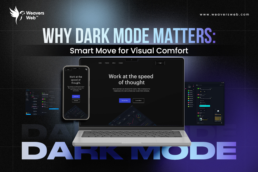
Why Dark Mode Matters: Smart Move for Visual Comfort
July 8, 2025
In this continuously evolving digital world, the dark mode is more than just an aesthetic trend. Apparently, you will find dark mode everywhere, with the chief operating systems like iOS, Windows, and Android now offering a dark theme to their users. But why?
It has emerged as one of the crucial aspects of UI/UX design, offering comfort and improved accessibility to users. As screen time is increasing rapidly all across the globe, visual comfort is no longer an option but a necessity of the hour. Latest statistics show that people spend an average of 6 hours and 40 minutes every day on screens. With more screen exposure, millennials and Gen Z have been suffering from several issues, such as disrupted sleep cycles, headaches, and even eye strain at large. This is where dark mode comes into play, offering a layer of protection.
The dark mode reduces the brightness and the glare, thereby providing a more comfortable viewing experience in settings with low light. Hence, product owners opt for UI UX development services not only for sleek designs with aesthetics but also to ensure that the user interfaces also prioritize the comfort of the users. This is further evidence that promotes the fact that the digital landscape is becoming more user-centric, and the dark mode is emerging as a strategic design aspect.
What is Dark Mode?
Dark mode, also known as night mode, is a design setting where the usual color scheme is inverted, placing light text against a dark background. It is a contrast to the traditional light mode and helps reduce eye strain, especially in dimly lit environments. Once a niche favorite among developers, dark mode has gone mainstream, featured in apps, operating systems, websites, and design platforms. Presently, it is integrated as a built-in feature, offering users the option across various devices, thereby catering to personal comfort. The dark mode has also been implemented by several top global brands like Google, Microsoft, and Apple. In fact, most devices, applications, and browsers are now offering this mode, thereby letting you ditch the traditional white screens and relax your eyes.
Why Dark Mode Matters
Dark mode or theme is not a trend any longer. It has become a strategic element of the modern digital design landscape owing to the fact that people have been using technology. It helps in cutting down the glare and brings a more calming and focused effect on the digital experience while saving the battery of the device. The businesses are now focusing on dark mode as an essential user-centric feature and investing in UX design services accordingly.
Here are the top reasons why dark mode has shifted from being a trend to a standard feature:
Reduces Significant Stress in Eyes in Low-Light Conditions
The night mode significantly decreases the brightness of the screen, thereby protecting your eyes against fatigue and preventing glares, mainly during night and low-light settings. It reduces the emission of blue light, making the display feel softer and more in tune with the surrounding light while boosting comfort for long-term use.
Better Aesthetic and Brand Appeal
One of the spectacular advantages of dark theme is that it enables brands to develop a stylish and modern interface that mostly appeals to tech-savvy and younger users. Additionally, it also helps brands showcase their visual identity while keeping things easy to read and user-friendly, both in bright daylight and low-light settings.
Increases Focus on Text-Heavy Content
Thedark mode strips away the glare, making it easier to concentrate, especially when working with content that demands attention, like lines of code or long-form writing. It’s no surprise that developers, content creators, and designers mostly prefer darker themes. When done right through experienced professionals offering UI UX development services, it ensures clarity while keeping things easy on the eyes.
Improves the Efficiency of Battery
In devices that are characterized by OLED or AMOLED displays, the dark mode tends to contribute to saving battery life. Since these displays use less power to show darker colors, switching to a dark interface tends to extend battery life a bit further. As digital experiences continue to expand across different screens and platforms, that extra efficiency becomes a bonus.
The Psychology of Visual Fatigue
Visual fatigue is also commonly known as digital eye strain and has become a common issue among the present generation. This is because the present data indicates that younger users are into more screen time compared to the older generation. People, particularly from the age group of 16 – 24 years, tend to spend 7 hours 32 minutes per day. This has resulted in a surge of visual fatigue, the symptoms of which comprise dry eyes, blurry vision, and problems in concentration. While the dark mode theme is unable to cure it entirely, it definitely contributes to tackling the glare that keeps the users scrolling in discomfort.
Studies and reports have found that constant exposure to bright light can throw off the body’s internal clock by suppressing melatonin, making restful sleep difficult. On the contrary, the night mode tends to develop a soft and low-light interface for the users that helps them with improved focus while decreasing the strain on the eyes. It also helps users to stay engaged without fatigue, which is an essential factor for the professionals offering UX design services.
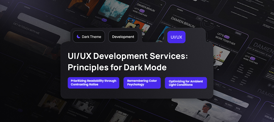
UI UX Development Services: Principles for Dark Mode
To ensure effective designing of dark mode, the designers need to adopt proper UX principles that focus on readability, accessibility, and contrast to ensure a smooth and comfortable user experience on every device.
Prioritizing Readability through Contrasting Ratios
Professional designers must maintain relevant contrast between the text as well as the background without the need to be dependent on pure black. As a matter of fact, the tones of dark gray tend to be more efficient in reducing the harshness while also maintaining the overall clarity.
Remembering Color Psychology
Color psychology is one of the most crucial elements that should be kept in mind. Hence, bright or overly saturated colors that have the power to put a strain on the eyes in dark or low-light conditions should be avoided. On the contrary, opting for soft tones can create a balanced visual hierarchy.
Optimizing for Ambient Light Conditions
Dark mode tends to work best when it adapts naturally to changing light conditions. A planned design can automatically change the themes depending on the time of day or the surrounding brightness, creating a seamless and comfortable viewing experience.
If you are still thinking that dark or night mode is just an aesthetic trend that will pass away, you are wrong. With the increase in digital consumption, users have preferred options that can lower the impact and reduce eye strain while enabling them to gain a seamless digital experience. Right from improving user focus and engagement to increasing battery life, there are numerous benefits associated with this night mode. Businesses with digital products must consider adopting the dark mode feature that will add a strategic advantage in offering user comfort. This is why partnering with a professional and experienced company offering UI UX development services is necessary, as they can guide and deliver the desired results.

 E-Commerce & Marketplace
 Fintech
 Healthcare
 Logistics & Transport
 Travel & Hospitality
 Media & Entertainment
 Education
 Legal
Legal On-Demand
 Fitness
 Social Media
 Job Search
 Real Estate
 Sports
 Fashion & Lifestyle
 Food & Beverage